Giv
Let’s face it. We are busy people. Yet, most of us still want to do good. We don’t have time to scour the internet to find the perfect charity to make a donation.
Giv will give you that time back so you can give back, too.
THE CHALLENGE
The majority of potential donors face the barrier of not knowing where to start when looking to donate, and pondering exactly what impact their donation will have.
HOW I SOLVED IT
Giv is an app that reduces overwhelm and increases trust in the charity donation process. It accomplishes this by tailoring top vetted organizations to users’ preferences and simplifies the donation process to make it easier, faster, and more secure for all. Giv reduces unwanted time spent researching organizations on Google, not knowing where to begin or who is actually using donations in the ways they promise. This solution leads to an increase in donations to responsible nonprofits globally and greater user gratification.
WHY I CHOSE THIS PROJECT
I have always been passionate about social impact and the nonprofit sector. In today’s age (and in the midst of the COVID-19 pandemic and racial injustice), nonprofits, their causes, and overwhelmed donors need support now more than ever. My goal was to create a product that helps donors have a personalized, seamless, and inviting donation experience while also helping to increase visibility and donations to charities.
MY ROLE
As this was a solo end to end project, I covered all the bases of the process serving as UX Researcher, UX Designer, and UI Designer. I conducted all facets of user research and discovery including: ideation, market research and heuristic analysis, user interviews, affinity maps, personas, empathy maps, user flows, user journey maps, you name it. That extensive user research led to the design heavy-lifting: information architecture, sketches and wireframes, UI design, prototyping, several rounds of usability testing, and lastly multiple iterations in order to arrive at the final product demonstrated below.
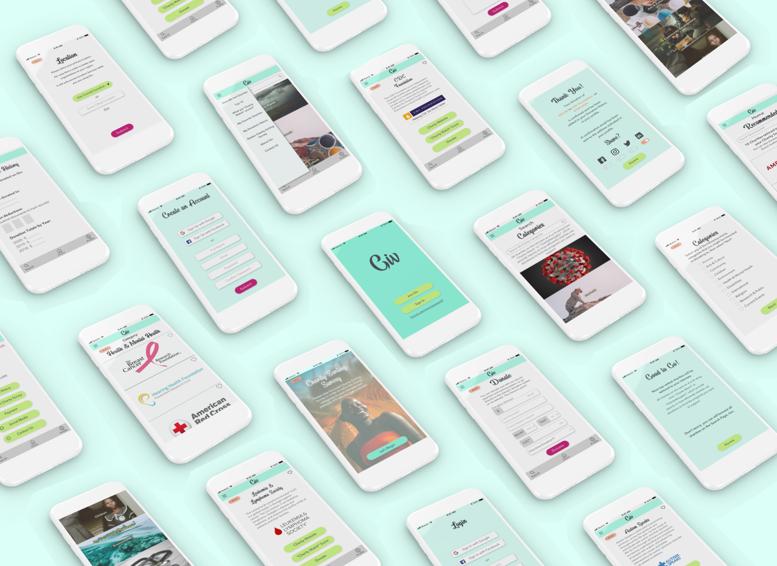
SNEAK PEAK OF THE SOLUTION
USERS
The target users of Giv are young working professionals (ages 20 - 40) looking for ways to donate to organizations without having to conduct extensive research on who to donate to -- that was my role for the first half of this project.
These users have a preference for mobile-first, efficient apps that are equally pleasant to use and fulfilling. Who doesn’t like that warm and fuzzy feeling?
Specifically, there were two types of users identified based on the research:

USER RESEARCH
The ensuing user research practices are where I really felt that I hit my stride. With a strong background in research, I have a passion and integrity for digging down to the root to get answers while keeping users at the top of mind. Plus. It’s fun.
Secondary Research
Donors want to lessen their cognitive load throughout their busy days but still want to trust that they are donating to ethical charities. This finding was discovered via secondary research, which was sourced primarily through white papers as well as journal articles on Google Scholar’s vast database. I was later able to confirm this finding through my numerous user research methodologies described below.
Screener Survey & Interviews

Once I identified what makes charity portal apps both great and fall flat, such as GoFundMe and Charity Navigator, I moved on to the screening and subsequent interviewing of five participants.
Quotes from Screener Survey
“Do you have any suggestions for how the charity search process could be improved?”
“Creating filters based on personal interests and causes supported.”
“Sometimes the transparency of charitable or non-profit organizations could be better.”
Data
Obtained from user interviews and screener survey:

60% of respondents donate either quarterly or monthly. That’s a lot of donations.

However, when asked, “How do you currently identify charities to donate to?”, 70% of respondents stated that they either ask others for recommendations, hear about it on social media, or quickly Google it. Are those sources consistently the most reliable, unbiased sources for deciding where to give your precious dollars? Maybe not.

“What is your typical donation style?”, the vast majority of participants responded that they search for specific causes that pertain to their interests or wait until they get a recommendation.
Affinity Mapping
From here, I was able to parse out key user insights and cluster them into groupings using Affinity Mapping to help clarify the critical aspects of the MVP. Interestingly, the qualities of two personas began to materialize.


Personas
The two user personas consisted of information extrapolated from the gathered research. The two evident types of target users were named “Gryffin Williams” and “Katy Powell”.
Gryffin Williams
Gryffin Williams is an introvert who has a senior role at a large tech company. He deeply values logic, efficiency, and security. He has always used his company’s internal donation system, however, he has found a few minor flaws in it as well as other pain points. Although he appreciates the donation matching aspect, he can’t help but feel that donating to causes you believe in is very personal and he does not want his employer or colleagues to see this. He is also frustrated that there is a limited selection of only eight charities offered. Lastly, he is constantly worried about his credit card security, and wants to find a system that assures that his private information will be kept safe.
Katy Powell
Katy Powell is the free spirited type. She works at a nonprofit, she travels, she is extroverted, and she likes to create positive impact. However, she does not have a whole lot of loose cash, so she donates to causes that she cares about with caution. Her primary pain points are wanting to ensure that charitable organizations are ethical with their donations, getting overwhelmed when she tries to figure out who to donate to when she performs Google searches, and not having time nor energy to do in-depth research about each nonprofit. “There are too many out there that I want to help, where do I begin?"
Once I had these critical personas established, I was then able to break down features to be included in the MVP using Mind Mapping, User Stories, Empathy Maps, and “How Might We” Problem Statements.
Mind Mapping
User Stories
Empathy Mapping
User Journey Mapping
Gryffin Williams Journey Map
Katy Powell Journey Map
From conducting interviews and synthesizing data, it became evident to me that there were five primary aspects that people tend to care about. I created the MVP based off of these five gathered user pain points and needs:
“How Might We…”
This was the critical central point of the Double Diamond Design Process where I was able to synthesize all my research and develop a solution statement in the form of the first HMW. From here, I was able to delve into the solution using Information Architecture.


USER EXPERIENCE DESIGN
Once I completed my due diligence with this extensive user research, I had a sharp focus and a deep understanding of Giv’s users and what they need. I deeply enjoyed this portion of the process as I was able to optimize the information architecture to its greatest potential since I now had a strong foundation. I was therefore able to further ideate the necessary features to be included in the MVP. Cue: Site Maps and User Flows for the app’s red routes.
Site Map
User Flows
Based on the user flows, I constructed the site navigation to feel fluid and natural to ensure immediate access to relevant information. Whether it was the user flow of onboarding, browsing through Giv’s charity recommendations, or learning about all of the other features Giv has to offer. Featured below is the sketched flowmap, which then transitioned into a paper prototype. After conducting guerilla usability testing and making any necessary adjustments, the wireframes and wireflows were born.
Sketches
Wireframes
USER INTERFACE DESIGN
As an artist who has a passion for color and photography, I found the visual design portion of the project thrilling. After playing around with a moodboard, I settled upon two opposing yet equally complimentary motifs for Giv based on the user research.
A) A calming, tranquil tone that invokes trust in the user when researching and donating to charities, especially when the charities are regarding heavy topics.
B) An attention-grabbing, playful theme intended to invoke a sense of inspiration and benevolence.
Moodboard
I decided to go with four complimentary colors for my palette. In particular, for my primary color palette, I decided upon the “cool colors” of blue-mint and grassy green to provide a tranquil, earthy, and trustworthy atmosphere for researching charities. For my secondary color palette, I selected “warm colors” such as vibrant magenta and red-orange for action items like buttons and links to keep the mood light and inspiring to donate. These objectives were also achieved through the use of rounded corners, a trendy and fun headline font yet clean body text, dramatic images, clear icons, and inviting copy.
UI Styleguide
Prototype
Giv InVision Clickable Prototype.
The combination of these moods and the UI elements resulted in the first iteration of Giv’s high fidelity screens, which proved to be a raw version of the final sculpture, so to speak. Later, after completing two sets of five usability tests and gaining invaluable insight from target users, the chiseling away of minor, last-minute usability issues ensued. At last, the final iteration of Giv was sculpted, as displayed below.

Quotes from Usability Testing
“Giv is laid out nicely, very user-friendly and intuitive, it’s enjoyable, and I love the premise.”
“Wow! ‘Contact Us’ is in both places: the Hamburger Menu and the profile. Thank you for doing that! That makes it so much easier for me. Today, I was infuriated because I had to go in circles looking for specific questions on a different website. I felt like they were hiding the specific tabs from me.”
“I am impressed. I know how much thought goes into making a design look and feel like how you would want it to look and feel.”
“I love the visuals of the app, especially the eye-catching images on the charity search page”.
OUTCOME AND LEARNINGS
Giv was well received among users during usability testing. Through their positive feedback and seamless final round of usability testing, participants confirmed that Giv would be a helpful app for both types of user personas.
However, I am not going to pretend that this case study was entirely easy. Nothing you are proud of should be easy though, right? Throughout this extensive project, I simultaneously endured some of the toughest months of my personal life. (Oh yeah, not to mention the fact that the second half of the project was completed during the COVID-19 crisis. That made usability testing very intriguing indeed!) Regardless, I was able to persevere and not let adversity stop me from my goal of creating Giv. I was grateful to work on this project not just because it was the primary constant in my life, but because it is one that is trying to improve the lives of others, too.
I am infinitely grateful to my mentor, Emily Holmes, who has supported me in my persistent dreams for this project and what comes next. Lastly, thank you to my reader for your time and support, too.
While things are wrapped up for this case study, I am a firm believer that no project is ever fully complete...
NEXT STEPS:
The primary future-looking steps that I have been marinating on include but are not limited to the following:
I would like to eventually launch Giv on the app store and measure its impact in the realm of charitable giving
a. I am in the beginning stages of collaborating with a developer and seeking guidance from a product manager to bring Giv to market eventually
Creating a social aspect to connect with fellow donors who share similar interests
Incorporating a “News Feed” function that displays information from your “Favorite” charities and peers regarding “Impact Reports”, events, articles, popular posts, etc.
a. Option to have donation “Impact Reports” delivered directly to your Giv inbox
Constantly updating the provided charities to ensure they retain their ethical responsibility scores in collaboration with “Charity Watch” and “Charity Navigator”